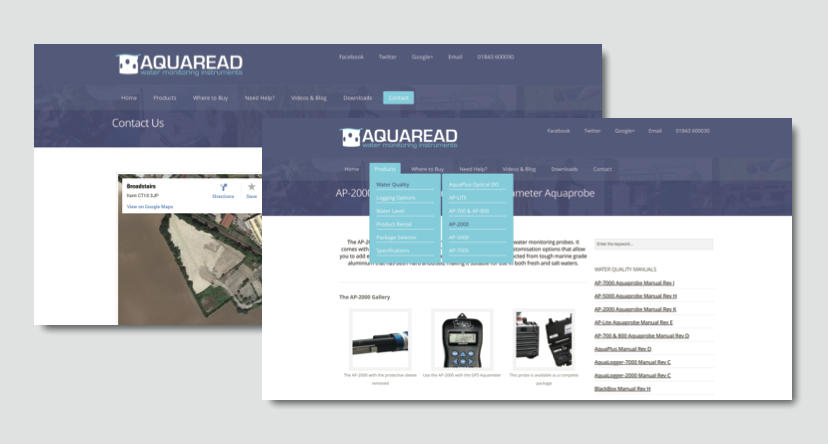
As you may have heard, Aquaread is celebrating the recent office move by launching a new website and logo. We want to give you a sneak peek at the new design. Here’s a quick snap:

As you can see, the new design features our new company logo in the top left, and the new company colour scheme, purple and blue throughout the website. We’ll be launching the new site soon, and you’re the first to have seen the new design!
We think it is looking great, and we’d love to hear your thoughts too. Why don’t you leave a comment below to let us know?
